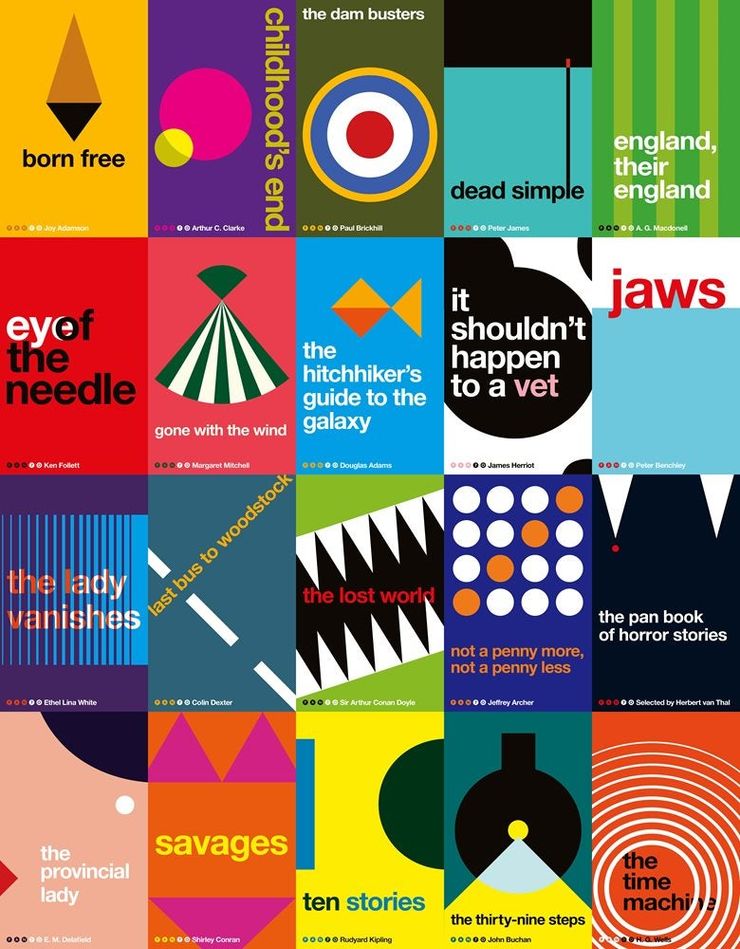
The Hitchhiker’s Guide to the Galaxy – a visual history
The Hitchhiker’s Guide to the Galaxy is an international phenomenon and a pop-culture classic. Here, Pan Macmillan design manager Stuart Wilson takes us on a journey through the visual history of this iconic series.
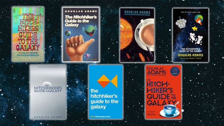
The Hitchhiker’s Guide to the Galaxy became a cult hit on its publication in 1978, hot on the heels of the huge success of the radio series of the same name. Following the galactic (mis)adventures of Arthur Dent, Hitchhiker’s in its various incarnations has captured the imaginations of curious minds around the world . . .
Here, design manager Stuart Wilson takes us through the visual history of The Hitchhiker’s Guide to the Galaxy, explaining how the unique cover design of each edition evolved, and sharing his experience of working on the books.
Discover our ultimate guide to The Hitchhiker's Guide to the Galaxy.
Looking for more sci-fi? Don't miss our edit of the best science fiction books of 2020.
The original
I am and will always be two years older than the first release of The Hitchhiker’s Guide to the Galaxy. It has always been part of my life and a fundamental part of me. I was first aware of Douglas Adams’s genius when The Hitchhiker’s Guide to the Galaxy was adapted for television by the BBC in 1981 and I was hooked by the strange quirkiness and sarcasm of the characters. But The Hitchhiker’s Guide to the Galaxy originally came to life as a radio series in 1978, with the book following shortly afterwards. 2020 marks the 42nd anniversary of the radio series – a very important number, as any fan of the series will know.
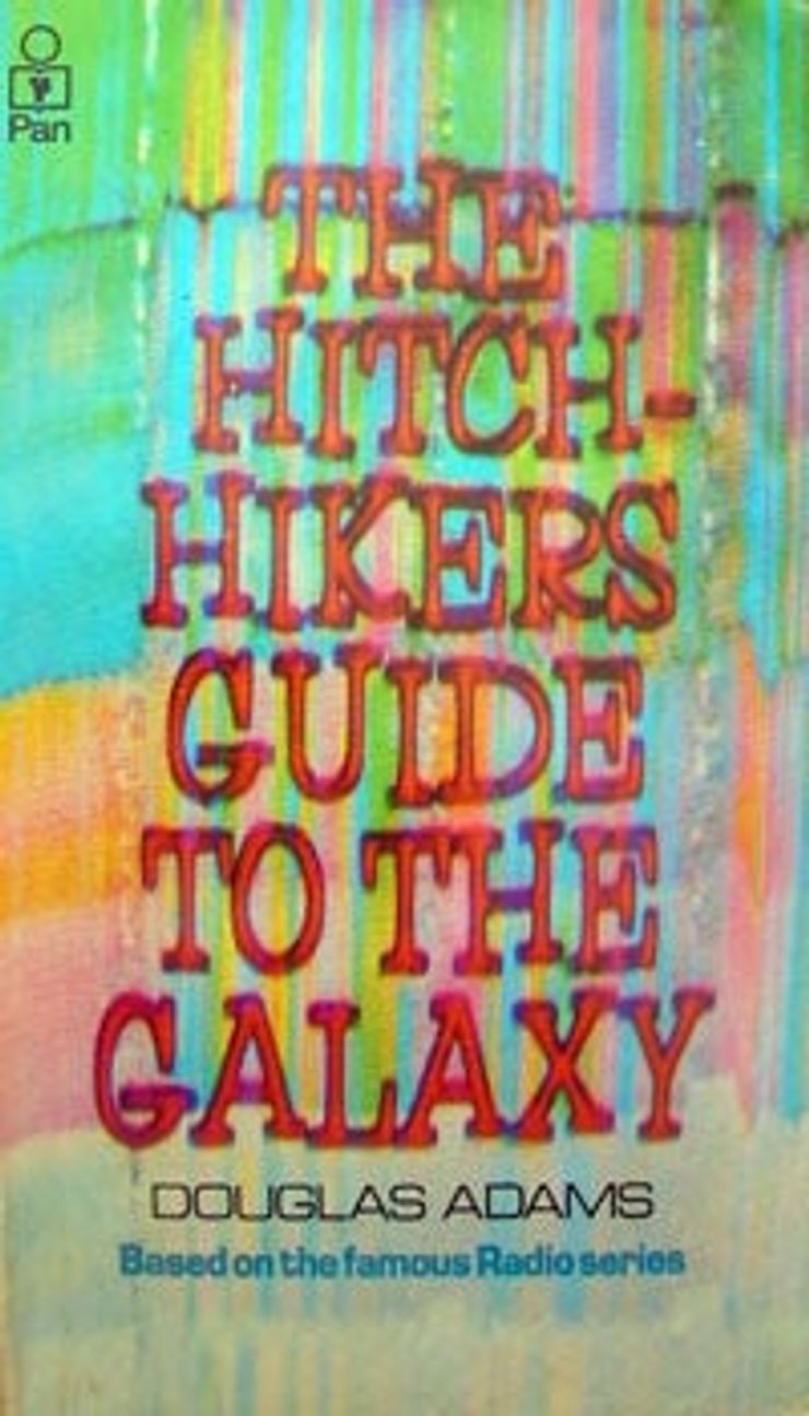
The cover designs for the books have been as varied as the galaxy, but some have stood the test of time better than others. The original cover, with its blur of space time reflecting the whirring of the infinite probability drive, remains my favourite.
Don’t Panic
Humorous book cover design of the late 70s and early 80s took a lot of inspiration from the work of Monty Python’s Terry Gilliam, often having the same handmade, comic cut and paste aesthetic that Gilliam’s work employs.
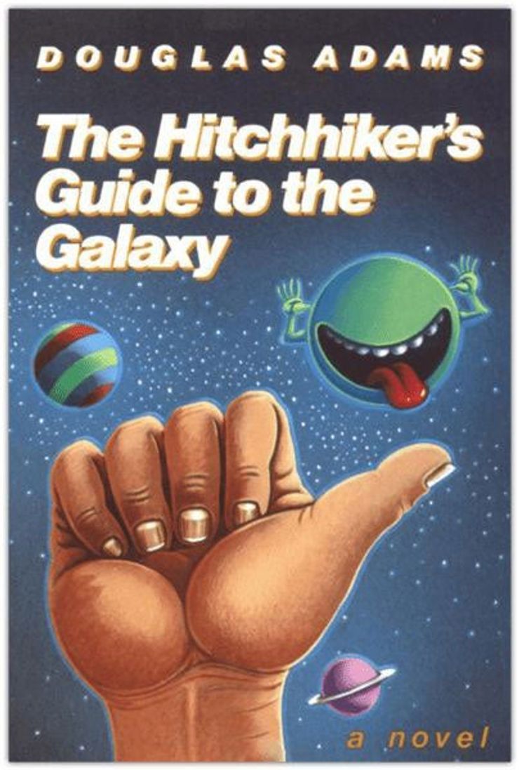
This example, full of character and humour, is very much of its time. It features the same tonal range and shading as Gilliam’s work which you can see more of here.
The laughing Vogon is pictured, having just destroyed earth for a hyperspace bypass (or possibly just having read out some of the third worst poetry in the galaxy).
The Storm
Storm Thorgerson (1944–2013) was described by Douglas Adams as ‘the best album designer in the world’.
The legendary designer’s work is highly conceptual and surreal in nature. He is most noted for his work with Pink Floyd, having been at school in Cambridge with Syd Barrett and Roger Waters. He also worked with Led Zeppelin, Black Sabbath, Peter Gabriel, Genesis, Yes, Muse and Biffy Clyro amongst others.
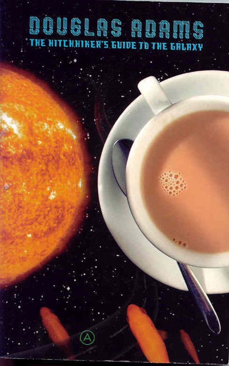
These editions of the ‘trilogy of five’ use parts of images to create planets or worlds that link together to form the galaxy that Arthur Dent inhabits. As with all of Thorgerson’s work, there is a simplicity in the concept which hides extra layers of meaning and imagery.
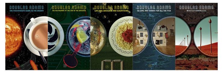
These particular covers were designed whilst Thorgerson was part of Hipgnosis, a company he founded with his good friend Aubury Powell and latterly Peter Christopherson. They disbanded in 1983 having left a huge legacy of creative work that is still very influential today.
Storm’s work can be found at www.stormstudiosdesign.com.
Crushed
For the thirtieth anniversary Pan Macmillan wanted to drive a hyperspace bypass through what had been before and refresh the series with something truly engaging and exciting.
Brighton-based creative agency Crush were given full rein over the design. Carl Rush, founder of Crush, said, ‘the brief for this project was totally open – do what you like . . . That made the job a little daunting. Chris Pelling, the designer from Crush who worked on the project was a big fan of the books, so it felt like a great pressure to come up with something stunning.’
They most certainly succeeded with their inventively designed DIY covers. Sticker sheets were provided in the book, allowing the reader to design their own unique book jacket. This fun way of constructing your own cover design was the perfect way to celebrate the thirtieth anniversary.
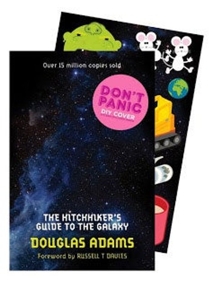
Here we see the DON’T PANIC slogan used on the cover with great effect, a reference to the cover of The Hitchhiker’s Guide in the books. In Douglas Adams’s series, The Hitchhiker’s Guide to the Galaxy outsells it’s competitor the Encyclopedia Galactica for two reasons: one, it’s cheaper, and two, it has DON’T PANIC written in ‘large friendly letters’ on the front.
Minimal
This was my first set of designs for The Hitchhiker's Guide to the Galaxy series. I wanted the jackets to feel like a collector’s edition or a special edition, with a sophistication to the design. It felt important to convey that Hitchhiker’s is not just a cult sci-fi read but a modern classic.
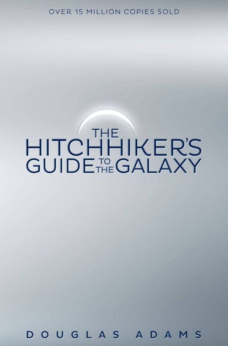
My initial approach was to create icons for each of the books: to boil them down to their essence. Each cover had a minimal design which referenced the title. For The Hitchhiker’s Guide to the Galaxy I wondered what a special edition of the guide would look like. My inspiration for The Restaurant at the End of the Universe was the restaurant’s menu, while the planet Krikkit influenced the cricket ball cover for Life, the Universe and Everything. A trail of bubbles left behind by a fish features on the cover of So Long and Thanks for All the Fish while on the cover of Mostly Harmless, an arrow points back to earth, the inhabitants of which are described as ‘mostly harmless’ in The Hitchhiker’s Guide. The covers were printed on a pearlescent paper that gave a shimmer to the artwork and the books had sprayed edges to give them more solidity.
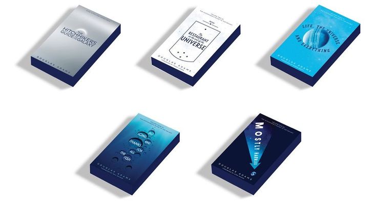
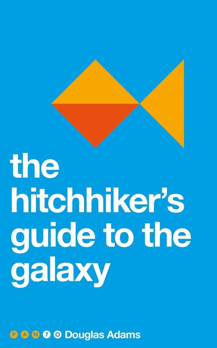
Colour
The Pan 70s were published to mark the occasion of the 70th anniversary of Pan books, as part of a special programme of events.
We wanted to celebrate some of the classic stories from some of the world’s best-loved writers that Pan had published over its first 70 years, including, of course, The Hitchhiker’s Guide to the Galaxy.
Using the aesthetic and ethos of Swiss design, the Pan 70s were based on a square, a triangle and circle, challenging us to see how creative we could be with them.
The covers were designed by me and Justine Anweiler, and we wanted to convey the vibrancy and colour of the stories in our artwork. Creating a recognisable image from just a few shapes was a very enjoyable challenge.
For The Hitchhiker’s Guide to the Galaxy, the Babel Fish provided an iconic and minimal take on the brief. In the series, the Babel Fish is a fish that crawls into people’s ears and enables them to understand any language they hear. This symbol of translation certainly conveyed the ethos of a series which is all about encountering the unfamiliar and absurd.
42
Deep thought was put into the more commercial fiction re-branding of the series for this year’s 42nd anniversary. The brief I was given was to make the new anniversary set of covers more accessible and approachable.
We soon decided that an iconic image and striking typography was the way forward. Like the reboot of a back up second earth, all of these covers actually refer back to and take inspiration from Storm Thorgerson’s covers.
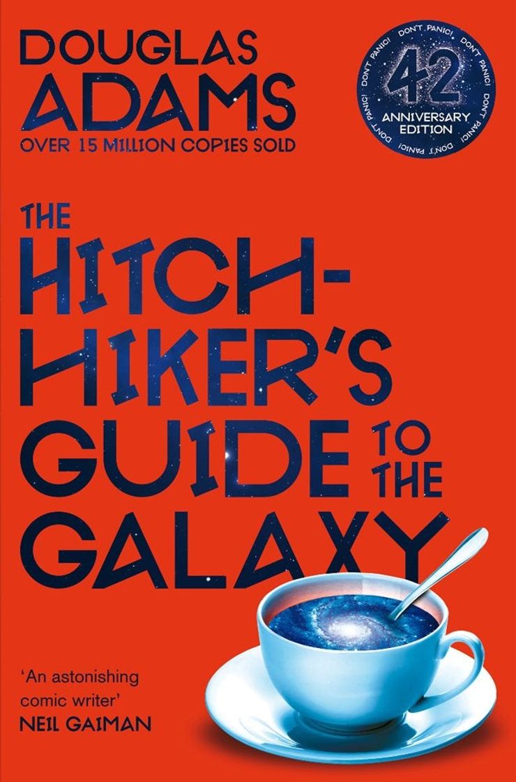
I wanted the images to have a duality to them and also a surreal edge. In addition to this, colour and a new typeface were all designed to make them more universal in feel.
With the typeface I wanted to create quirky, sci-fi inspired letter forms without losing sight of the brief. Each character has variations to make it more individualistic, and broken versions can be used as displayed letters. Dent seemed to be a perfect name for this new font.
No matter how much life makes you feel like Marvin the Paranoid Android, this funny and witty series has been a huge pleasure and privilege to work on.
Don't miss Book Break's guide to everything you need to know about The Hitchhiker's Guide to the Galaxy:
The Hitchhiker's Guide to the Galaxy
by Douglas Adams
The Hitchhiker's Guide to the Galaxy began life as a Radio 4 show in 1978 and has since spawned adaptations across almost every format, making it a staple on every respectable list of the best sci-fi books. Following the galactic adventures of Arthur Dent after his house's untimely demolition to make way for a new hyperspace express route, this new edition of 'the Guide' features exclusive bonus archive material and a new introduction from Russell T. Davies.
Discover all the books in The Hitchhiker's Guide to the Galaxy series here.
The Original Hitchhiker's Guide to the Galaxy Radio Scripts
by Douglas Adams
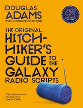
This collection is a faithful reproduction of the text which was published in 1985, featuring all twelve original radio scripts as they were broadcast for the very first time. This is a must-have piece of memorabilia for all Douglas Adams fans.

